

From obscurity to clarity: the story behind the Eluviant brand
.png)
A fresh look to fit our new name and the next era of AI in surveillance
With the launch of our first genAI model - Aurora - in early 2025, we knew that something fundamental had changed. Not just in our business, but in our industry. So we made the decision to go all in on a new name and brand to symbolise our shift to Video Intelligence.
We've already written about the thinking behind that change elsewhere. But since we've been asked a fair few times already, we also wanted to take the opportunity to share the meaning behind Eluviant and how that shaped the direction of our new brand identity.
Why Eluviant
Eluviant comes from the Latin elucidare: to light, to enlighten. It's the root of the English word elucidate.
We loved the obvious analogy - taking something out of darkness and giving it clear, intelligible form. That is Video Intelligence in a single word.
99% of surveillance footage goes unwatched. Our goal is not just to surface that footage, but to make it understandable. To provide clarity in a noisy world.
It is also no accident that the letters 'vi' sit right in the middle of the word...

A brand to match our vision
We aim to set the global standard for enterprise-scale video intelligence, by pushing past the limits of what we thought possible. We wanted Eluviant's visual identity to capture both our confidence in the power of AI to transform the sectors we work with, and our pragmatic approach to solving today's challenges in real-world environments:
The icon
Eluviant's 'matrix' icon originated from two core components. The AI spark to signal clarity, and a four-layer grid representing the different layers of AI we integrate into the platform to enable accurate detection and classification events plus the contextualisation and understanding needed to sort and prioritise them.
The colourway
The base of the brand is monochrome to create the space for our bold 'Eluviant green' to shine. Green isn't just associated with safety, it's also the colour of 'The Sage' - our core brand archetype, whose core desire is "the discovery of truth, wisdom, and knowledge".
The pixel motif
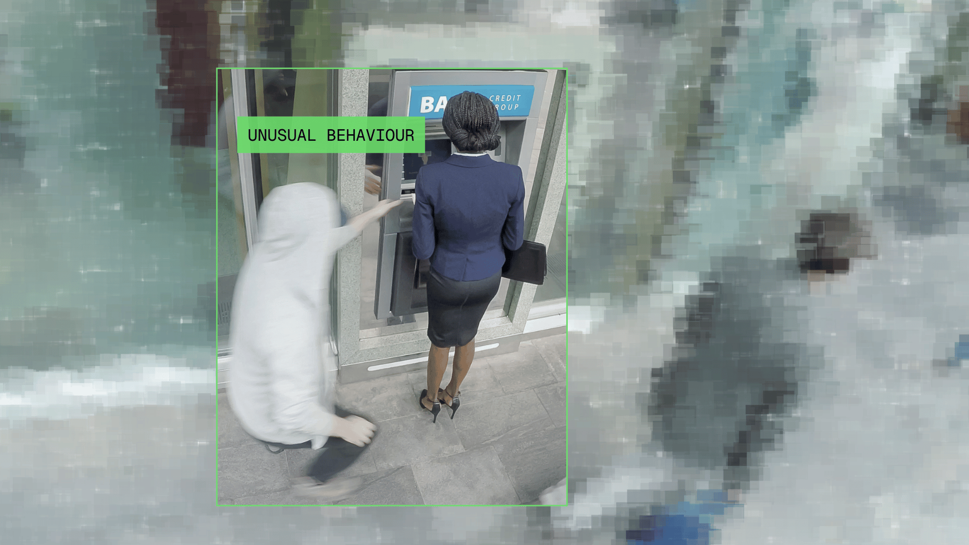
In video surveillance, it all ultimately comes down to a series of pixels. So we decided to make pixels and pixellation a recurring feature in our brand design. You'll see them pop up in lots of different places, from illustrations, to powerpoint slides, and even our virtual backgrounds on Teams.
Same company. New look. Even clearer mission
Nothing underneath the surface has drastically changed - we're still the same team, refocused on our mission: to turn existing camera infrastructure into operational intelligence, helping enterprises see more, understand faster, and operate with confidence.
It's what we're passionate about, and we're excited about what's ahead as Eluviant.
A big thanks to the wonderful team at The Branx who turned our ideas into the new brand you see today.




.svg)
